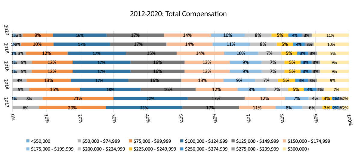
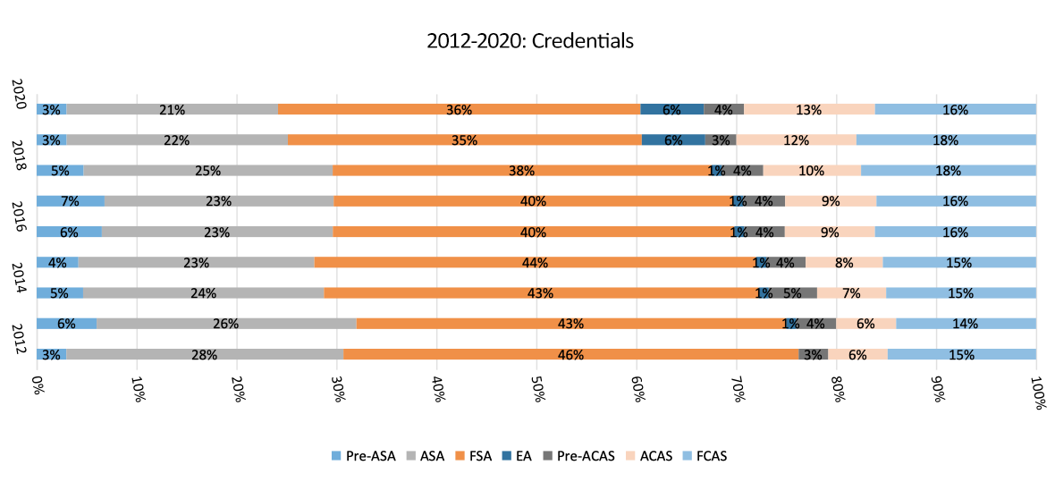
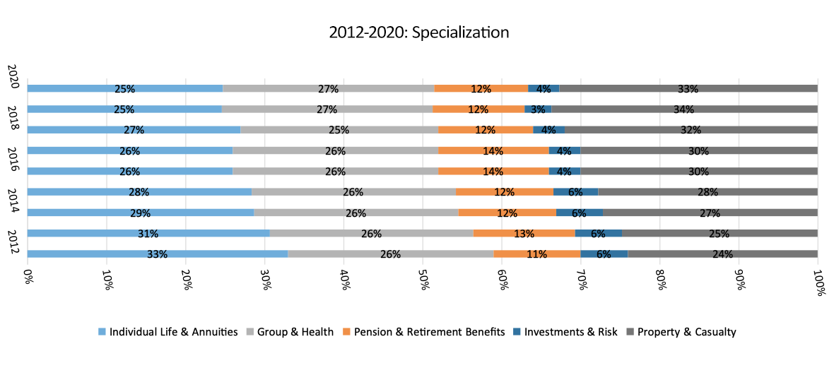
2020 Actuarial Salary Survey Graphs
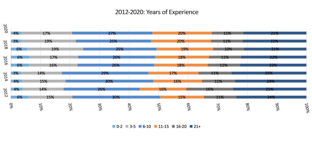
The following charts compare the results of our 2020 Salary Survey to the results all the way back from our 2012 and up Salary Surveys.
We encourage your participation in the survey. All entries are strictly confidential, and they enable us to help you stay informed about the salaries and trends in your profession.
IMPORTANT DISCLAIMER: Respondents for this survey were selected from among those who have volunteered to participate in an online survey or in recruiting databases. The data have not been weighted to reflect the demographic composition of the actuarial community. Because the sample is based on those who initially self-selected for participation rather than a probability sample, no estimates of sampling error can be calculated. The results should be interpreted as directional in nature, and may not be generalizable to an individual’s employment/compensation situation.
 Derek Chelednik -Senior Executive Recruiter
 Caitlin Beaird, MBA -Executive Recruiter
 Lindsey Nelson, Vice President
 Kieran Michaels, Principal & Owner
 Stephen Frost, Director of Research
 Stephanie LoRusso, Director – Administrative Services
 Lauren Lee, Assistant Vice President
 Jennifer Hart, Principal & Owner
 Jill Grayson, Principal & Owner
 Robyn Taylor, Senior Vice President
 Barbara Roman, Senior Vice President
 Jesse West, Executive Vice President
 Claudine Cox, Executive Vice President
 Patty Kent, Executive Vice President
 Aimee Kaye, Founder & Senior Advisor